
Week XIV
ARTISTAS Project
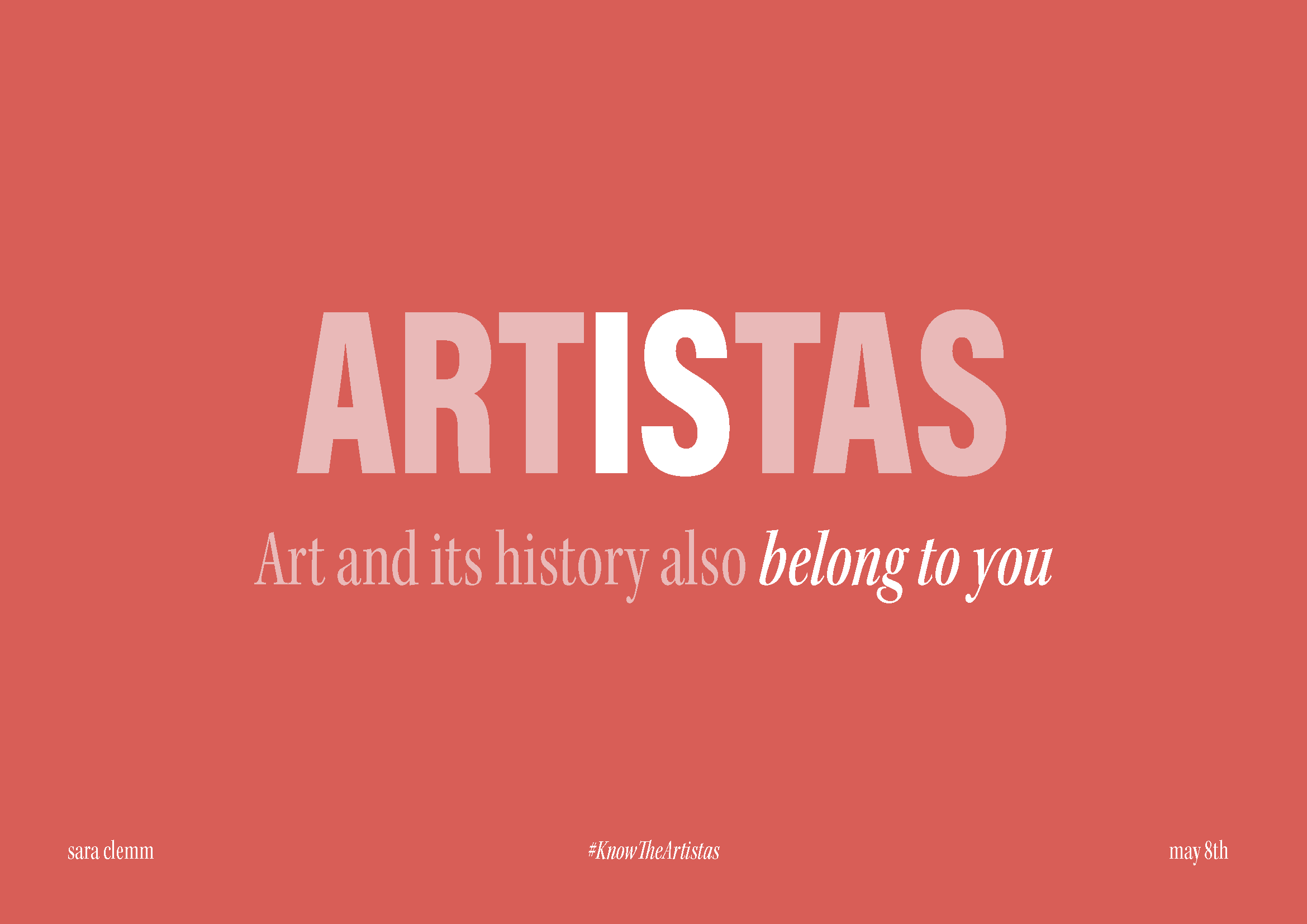
After a stressful week trying to develop a new identity for my project, I can finally see where this project is taking me. In Monday’s presentation, my pitch about ARTISTAS had very positive feedback and support from my tutor Fiona and the rest of the class, and after class, I was filled with excitement and confidence for the future of ARTISTAS. I can’t wait to start designing the deliverables! Here’s the presentation I did on Monday:


Feedback from Danielle
Despite having only one week left to work on my project, I find myself, again, lost and with a slight change of direction. I had a meeting with Danielle this Thursday and she provided some valuable insights that have helped me refine my approach, so I can create practical and tangible deliverables that actually showcase my graphic design skills. That’s what she was most concerned about. She advised me to move away from the idea of designing a street campaign, and instead, she recommended that I concentrate on creating impactful and tangible deliverables for the upcoming exhibition.
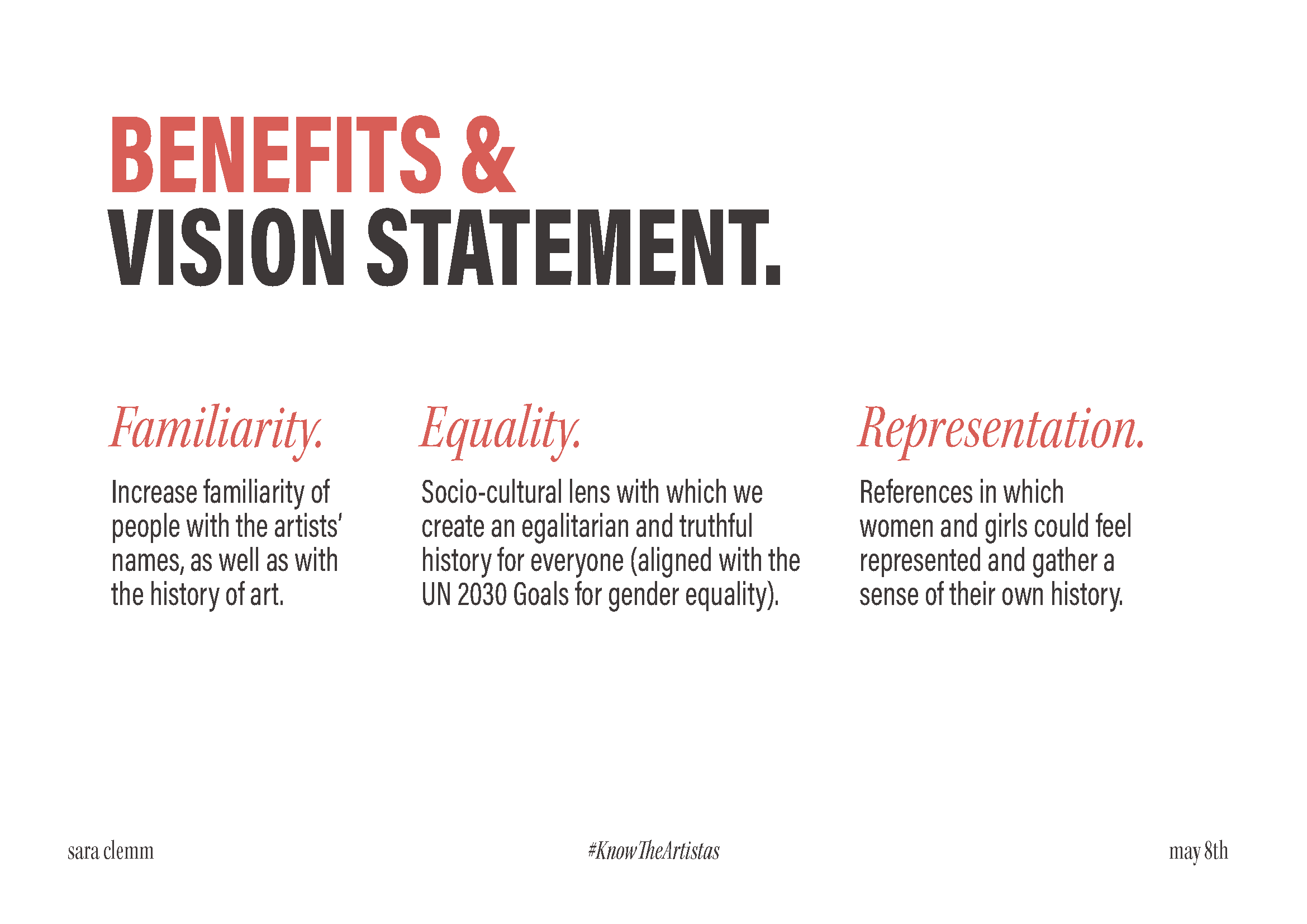
She gave me a bunch of ideas to help me get started. For example, one of them was to develop a website that features the work of female artists. The website would also provide useful information and resources, increasing the visibility and recognition of the artists. Danielle also suggested that I create a zine that discusses ARTISTAS and explains its mission and goals. This zine would be a fun way to educate people about the project and especially about the artist’s information.
I love this idea, and I think it will be a great way to condense all my research and knowledge into one piece. Nevertheless, I would have loved to have known about this possibility a long time ago, so I could have invested more time in it. In any case, I am excited to finally get to design and see the project come to life! I really believe that people will connect with my work and the ARTISTAS project in a meaningful way.
Designing the
Identity of ARTISTAS

Deliverables & Logo
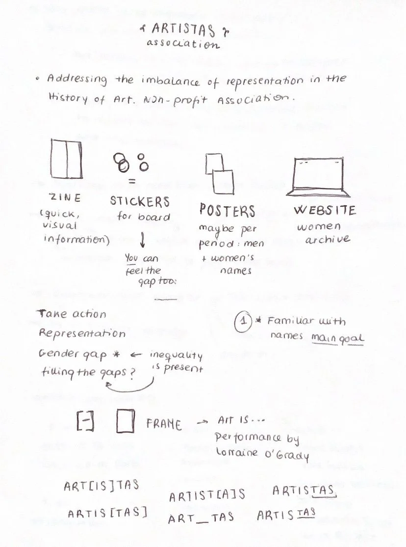
In this section of my notebook, I documented the various deliverables that I planned to design before the deadline and that could be relevant to my project. These included a zine with informative content, stickers for the exhibition, and posters highlighting different art periods with the names of both female and male artists. Additionally, I recognized the need to create a website that would serve as an archive for female artists.
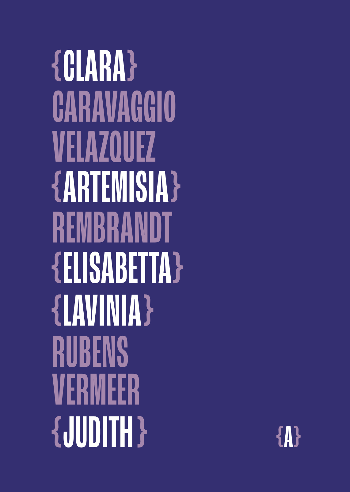
During this brainstorming session, I also dedicated some time to sketching potential logo ideas as I hadn't established one yet. I revisited the one-liner statement that focused on taking action against gender gaps in Art History. The concept of filling in the gaps visually resonated with me, and I began exploring different ways to represent it within the logo. I experimented with placing brackets around specific parts of the word "ARTISTAS" to symbolize this idea.
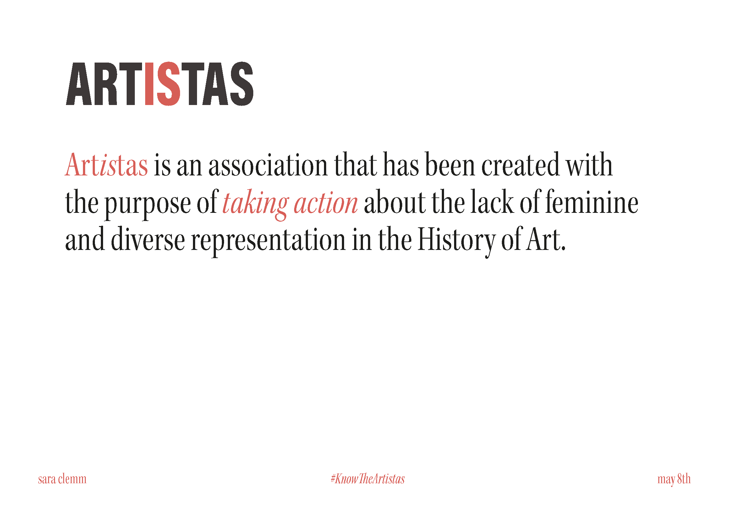
After careful consideration, I found that the solution of ART{IS}TAS held the most potential. Not only did it maintain visual balance within the word, but it also allowed for the wordplay of "Art IS" to remain an option, reinforcing the core message of the project. This process of exploration led me to a logo concept that summarized the essence and goals of ARTISTAS.
Content Structure
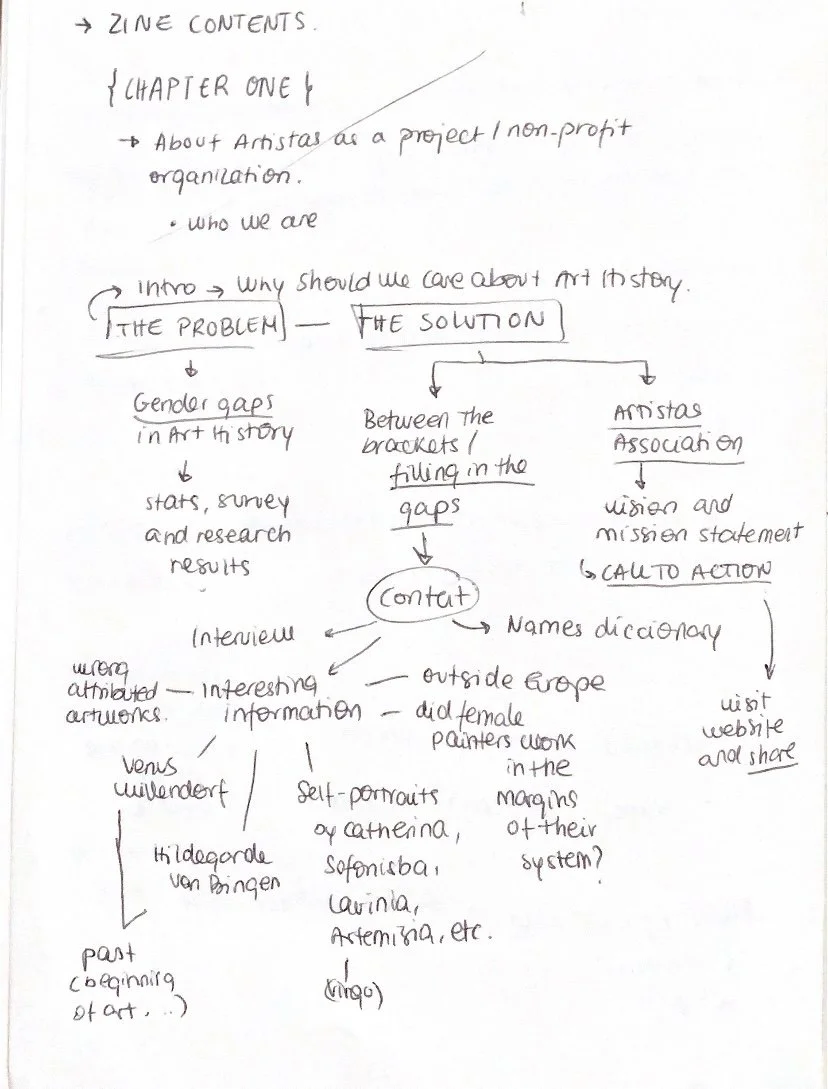
I also organized and structured the large amount of information I had gathered over five months. My goal was to create a clear and engaging story for the zine that anyone could understand. To do this, I split the research into two parts. The first part explained the main issue and why it's important for us to care about it.
In the second part, I talked about the solution, presenting a lot of information about women artists. But instead of organizing them by art periods, I grouped them based on topics that unite these artists. This made the exploration of their work more cohesive and dynamic. Although I kept a chronological order, the emphasis was on the diverse and interconnected nature of their contributions. By structuring the zine in this way, I aimed to make the information accessible and enjoyable for everyone. It was important to me that everyone could learn from it and appreciate the remarkable achievements of women artists.
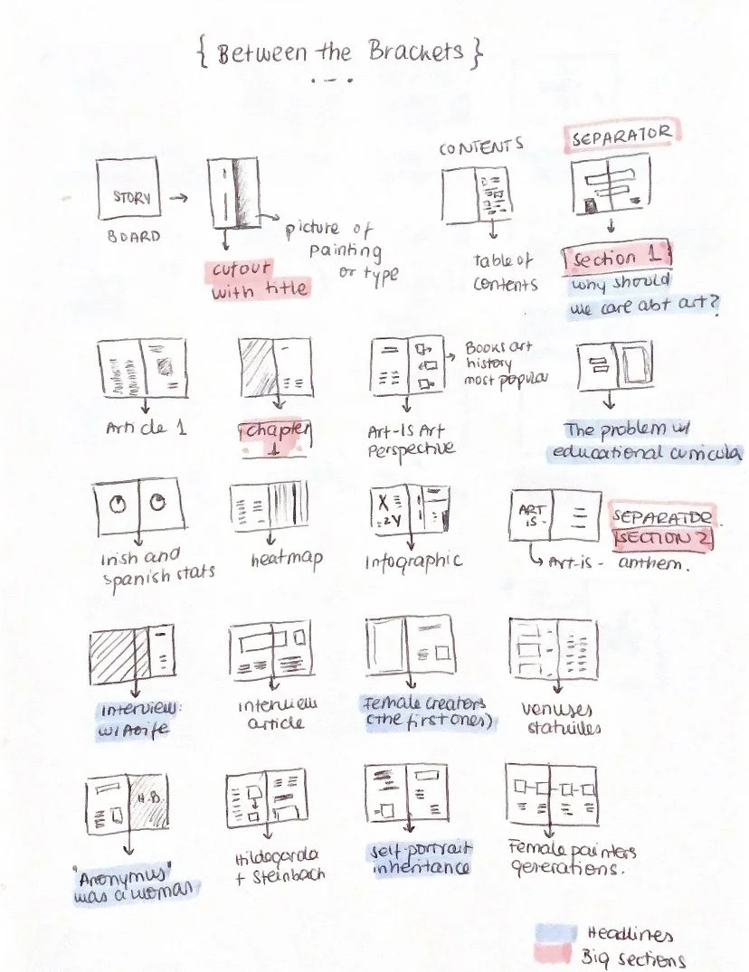
Finally, and after organizing the information in Notion, I created a page plan for the zine's layout. This helped me see how everything would fit together and made it easier to decide where to put text, images, and other elements. Having a clear vision of the layout early on was especially helpful because I had a lot of information to work with. It was great to have a roadmap to follow when I sat to design, and this page plan helped me optimize the presentation of information.
First Design:
Look & Feel


ARTISTAS aims to address inequality in the representation of artists in the History of Art by identifying and filling gender gaps. Brackets will play a significant role in the language of the association and the zine. They symbolize the inclusive space where artists, especially women, are acknowledged and integrated.
To further engage the audience and highlight disparities visually, I am considering designing a board where people can place stickers with artist names. This interactive activity will allow us to observe and compare the number of male and female artists mentioned. By organizing the stickers into two columns, we can visually depict the difference in representation and gain a better understanding of the existing gender gap in our collective knowledge of artists. This will provide active participation of the people in the exhibition and provides a tangible visual representation.
This is an example of the postcards I want to create. In this case, it shows the artists from the Baroque that we already know, and the female ones with whom we are filling the gaps in our knowledge.
#5WomenArtists Media & Shareables | NMWA. (2022, February 26). NMWA. https://nmwa.org/support/advocacy/5womenartists/shareable-content/
All SHE Makes. (n.d.). All SHE Makes. https://www.allshemakes.org/home
Art Is. . . - Lorraine O'Grady. (2022, October 11). Lorraine O’Grady. https://lorraineogrady.com/art/art-is/
ArtGirlRising: a statement for female artists. (n.d.). BMW. https://www.bmw.com/en/magazine/innovation/artgirlrising-statement-for-women-artists.html
Imagine a world. . . - CPB London. (2023, May 4). CPB London. https://cpblondon.com/portfolio/international-womens-day-imagine/
Merelli, A. (2022, July 20). Palaeolithic women likely knew a lot more about loving their bodies than we do. Quartz. https://qz.com/quartzy/1399713/a-different-view-of-gender-in-prehistoric-society-and-art
Myrone, M. (2018, June 18). Angelica Kauffman – Tate Etc | Tate. Tate. https://www.tate.org.uk/tate-etc/issue-43-summer-2018/lives-of-the-artists-angelica-kauffman-martin-myrone.
OUR IMPACT. (n.d.). Repaint History. https://repainthistory.com/pages/our-impact
Stand Up For Women Artists. (n.d.). ArtGirlRising. https://artgirlrising.com/
STORE — Guerrilla Girls. (n.d.). Guerrilla Girls. https://www.guerrillagirls.com/store
Subject Matter. (n.d.). Subject Matter. https://subjectmatterart.com/
WE ARE HERE, WE WILL BE SEEN. (n.d.). https://www.wherearethewomenartists.com/
Women Artists Action Group (Archive of Pauline Cummins) - EVA International. (2020, October 13). EVA International. https://www.eva.ie/artist/women-artists-action-group-archive-of-pauline-cummins/
Yerebakan, O. C. (2023, May 12). In Sensual Paper Cut-Outs, Xiyadie Carves Narratives of Queer Pleasure | Artsy. Artsy. https://www.artsy.net/article/artsy-editorial-sensual-paper-cut-outs-xiyadie-carves-narratives-queer-pleasure
Feel free to read my other blog posts! You can find them here.


Between The Brackets: Outcome
“There isn’t anything inherently different about work created by artists of any particular gender - it’s more that society and its gatekeepers have always prioritised one group in history” (K. Hessel, 2022)